Client
University of Warwick
Project type
Transformation

With a new brand strategy and ambitious goals for 2030, the University of Warwick set out to evolve its brand to reflect who it is today and where it's heading tomorrow. We partnered with Warwick to shape a bold identity grounded in ambition, authenticity, and community insight. Our approach was built on deep stakeholder engagement. Over 10,000 views were collected from students, researchers, alumni and partners.
They shared stories, challenges, and aspirations that revealed the unique character of the Warwick community. Their insights shaped a brand grounded in lived experience and future perspectives – reflecting the real ambition, character, and spirit of Warwick.
An in-depth discovery phase helped us identify a strong foundation for a brand rooted in a culture of "unconventionalism." Warwick is a place where experimentation thrives; where people are encouraged to challenge norms in pursuit of deeper truths and greater impact.
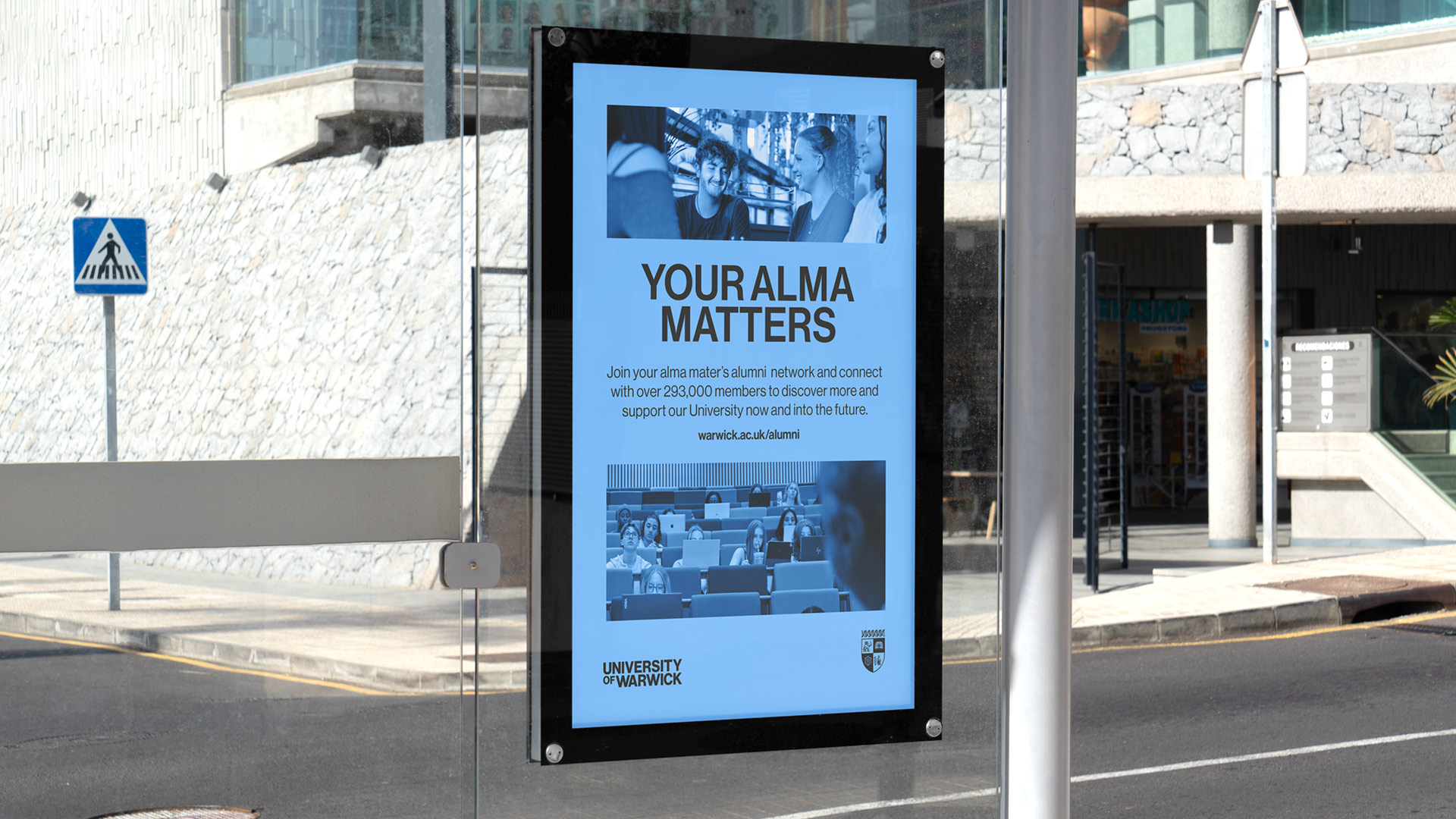
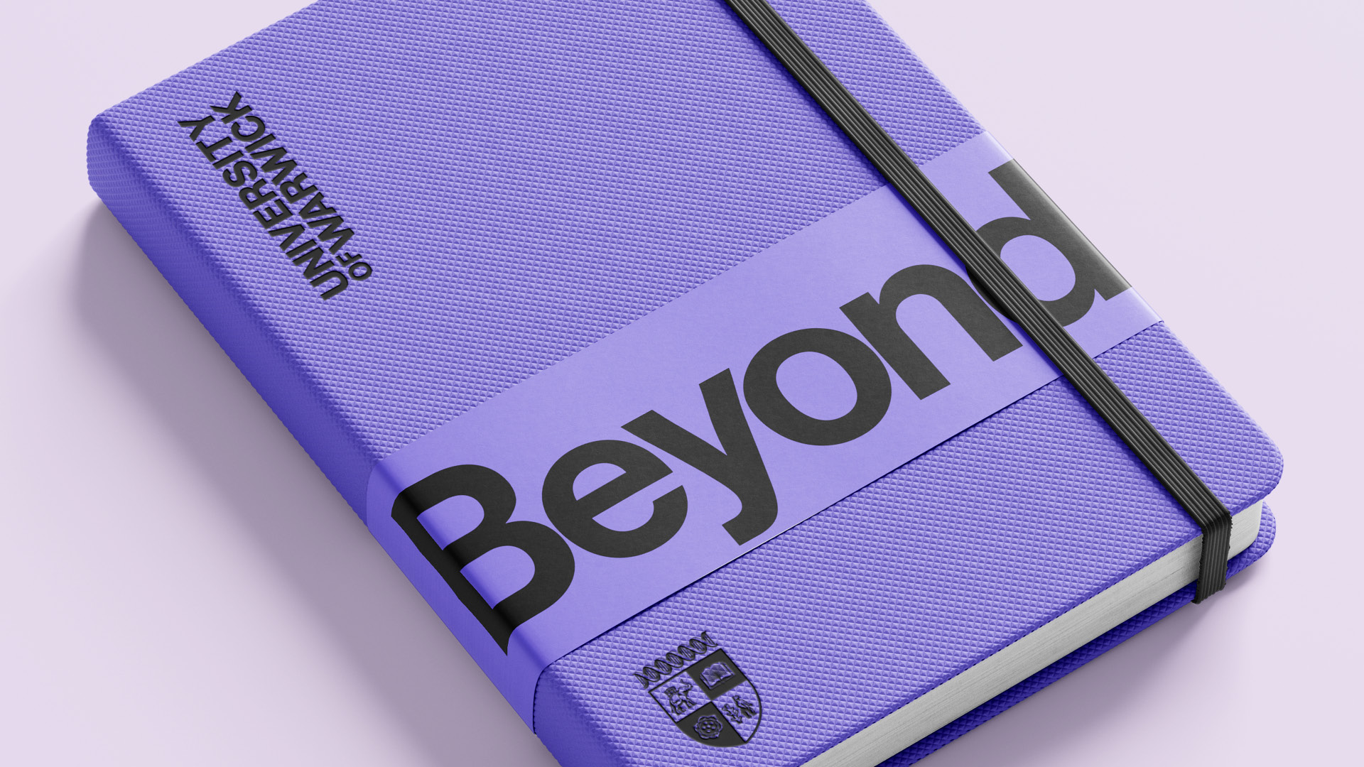
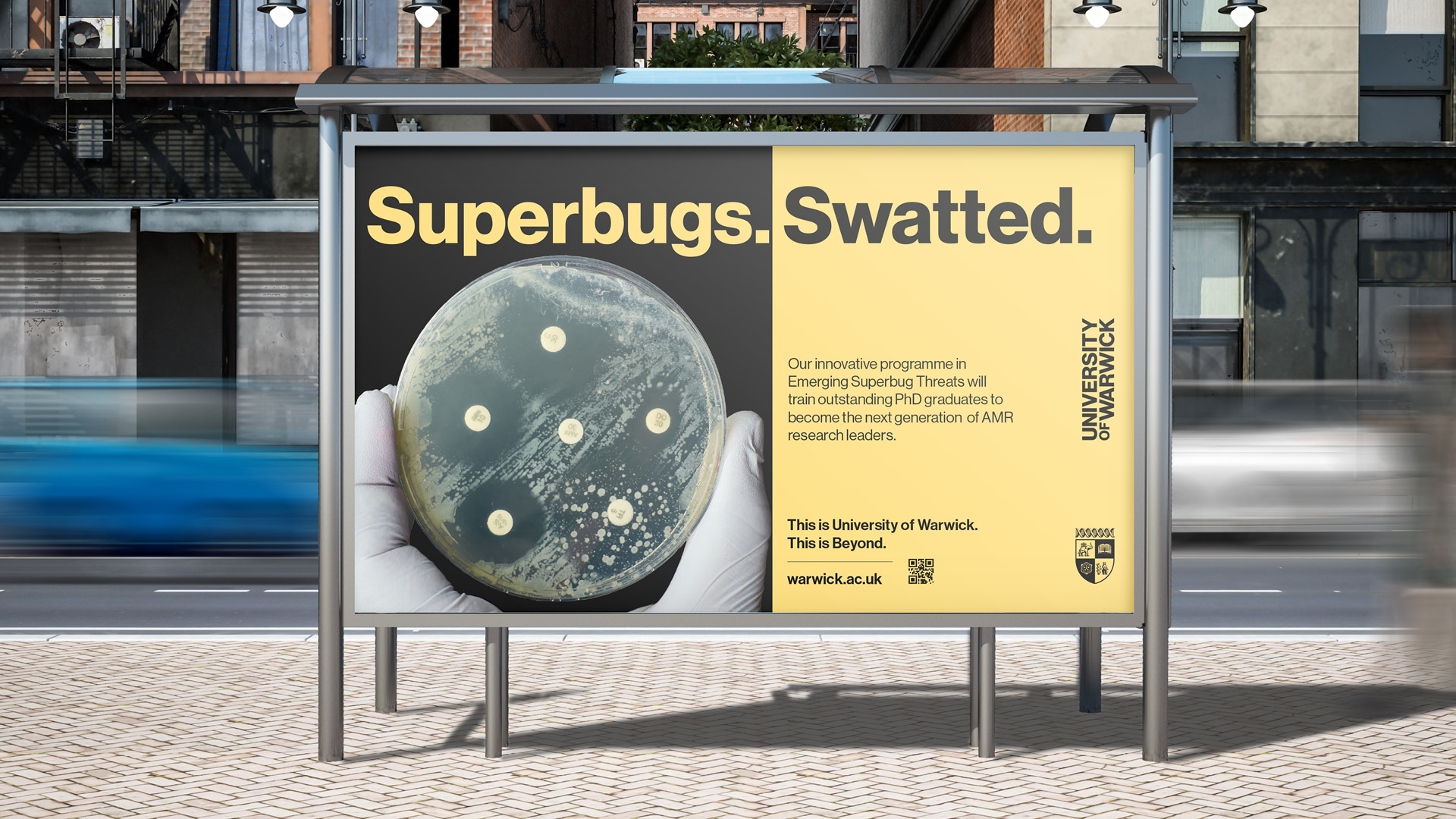
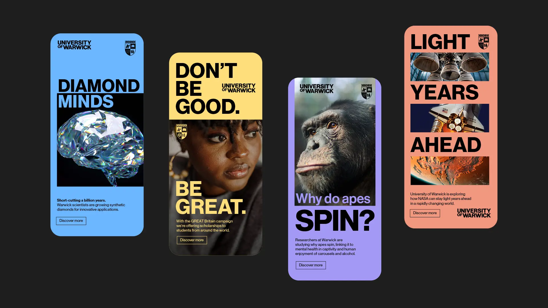
From this a mantra was born - 'Beyond'. This bold positioning statement reflects the mindset of the University and shapes every touchpoint of Warwick's brand, from its voice to its visual identity.
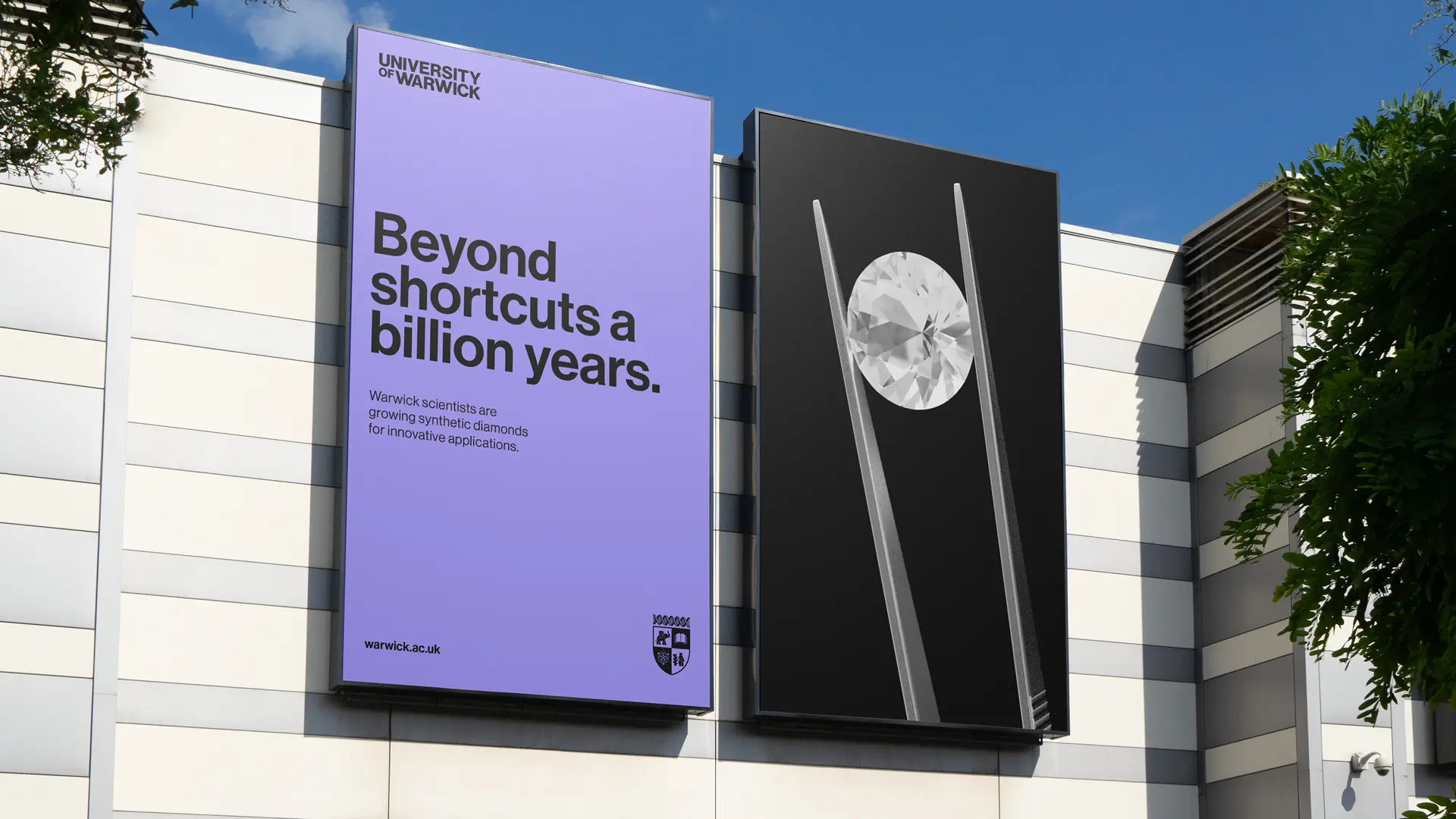
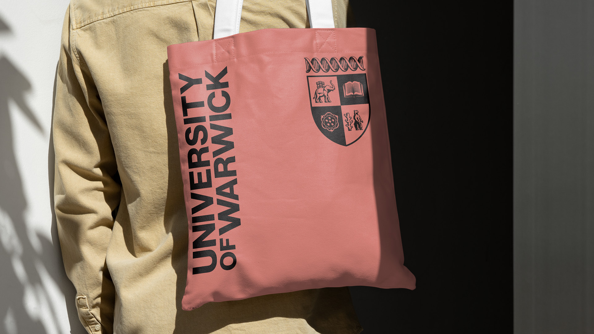
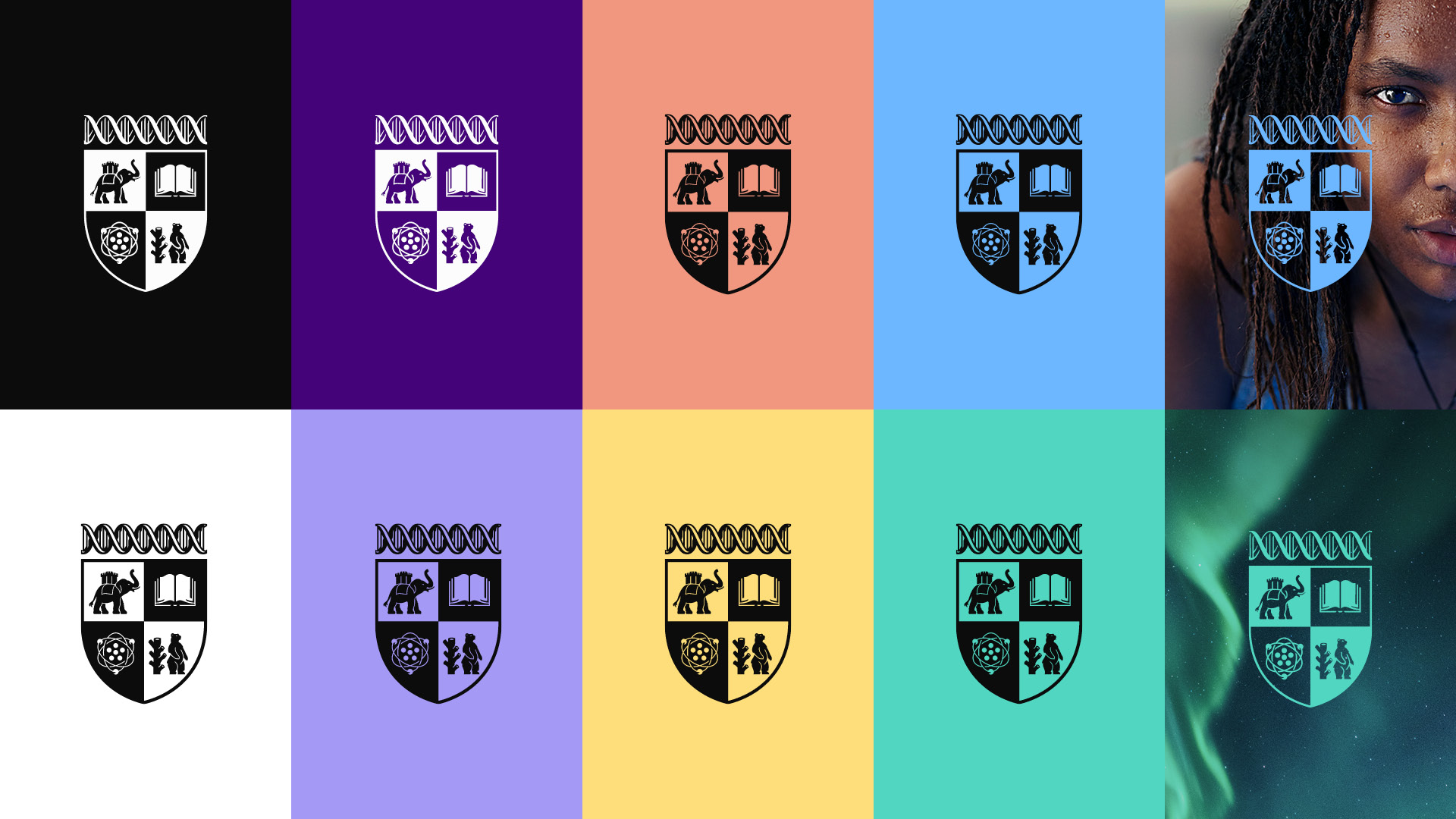
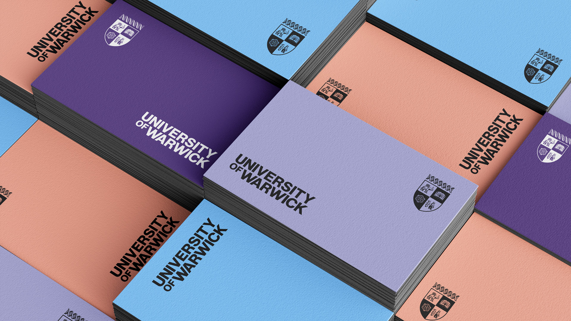
The refreshed brand logo set features a contemporary wordmark and a modernised Crest. Created in collaboration with illustrator Tobias Hall, the new Crest is derived from the original Coat of Arms but has been reimagined to look forward; designed for clarity, impact and versatility across digital spaces and smaller formats. This approach reflects Warwick's forward momentum whilst honouring its heritage.
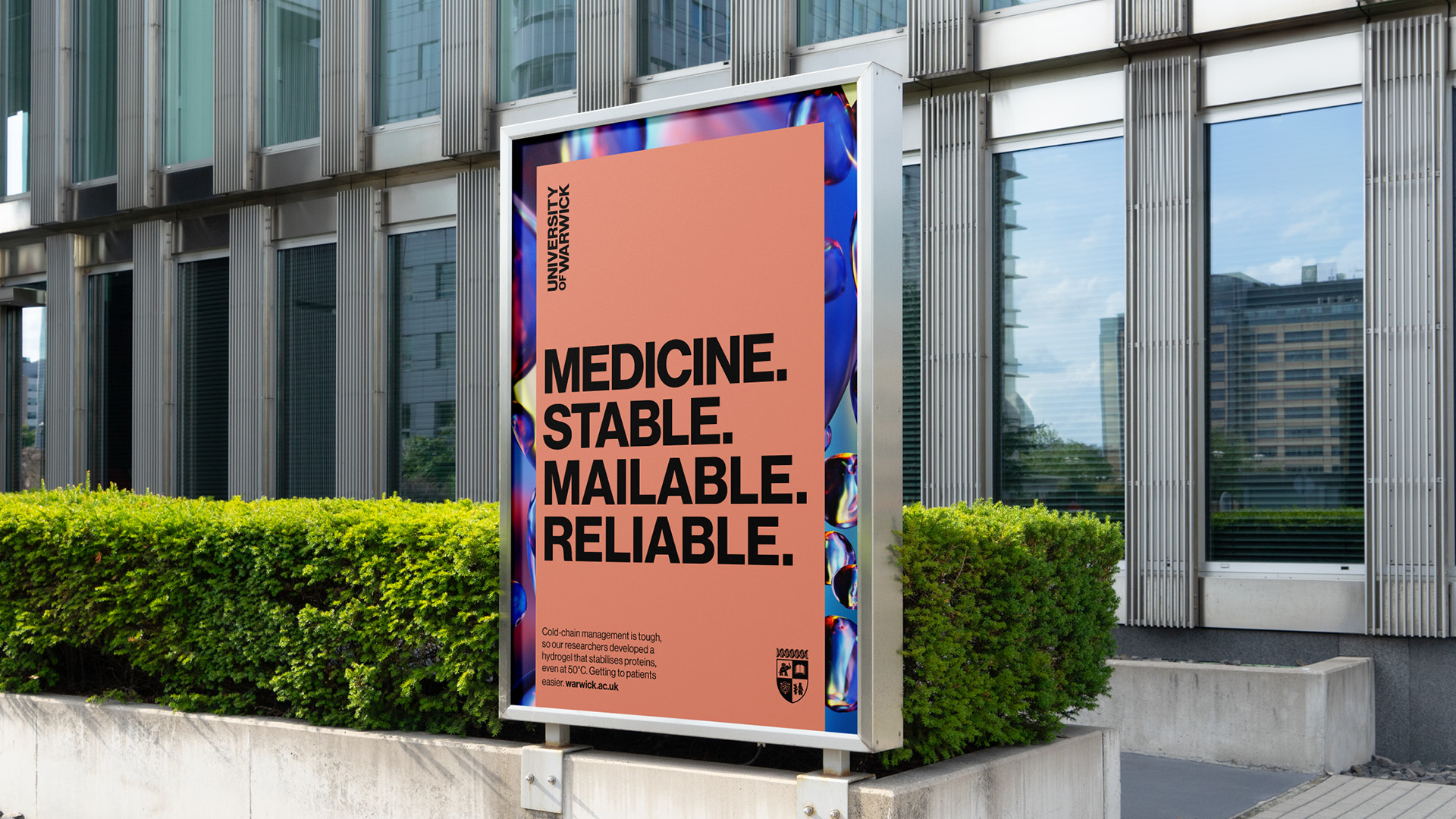
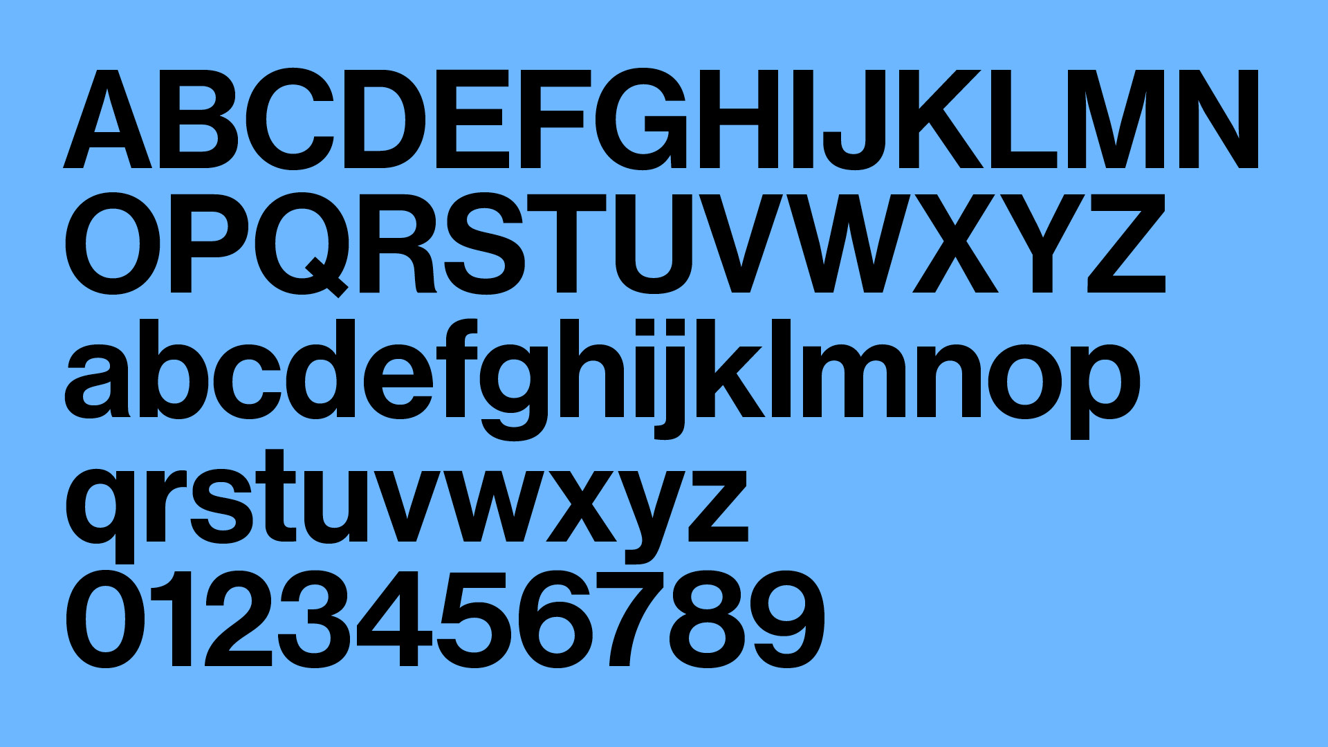
Digital pastel colours are an optimistic and unexpected choice for a university, working alongside Neue Haas Grotesk, maintaining clarity and accessibility across digital platforms. Modern yet inviting, this typeface has been selected for its clean, classic letterforms that work effectively in both print and digital.
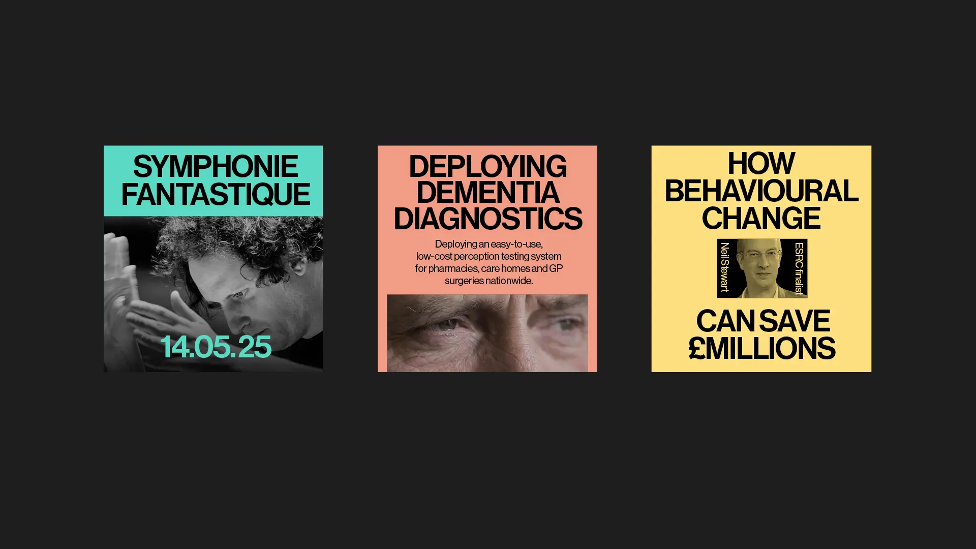
Each element of Warwick's visual identity is brought together on a grid system. This flexible framework can be clean and symmetrical or pushed into more fluid, asymmetrical layouts. This gives freedom for bold and varied creative, while ensuring every execution still feels unmistakably part of the University of Warwick brand.
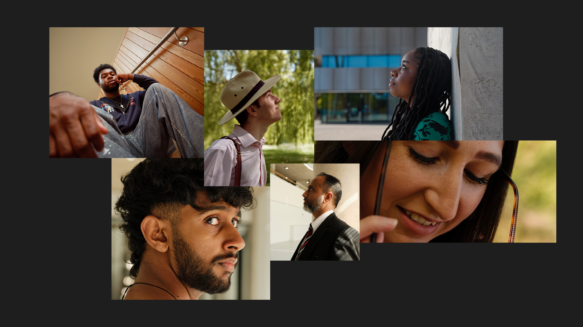
To authentically capture Warwick's unconventional spirit, we commissioned photographer Megan Eagles, winner of the Portrait of Britain Award and the Portrait of Humanity Award. Over three days on campus, Megan captured the essence of Warwick, enriching the visual toolkit with imagery that represents the community.